CSS media queries
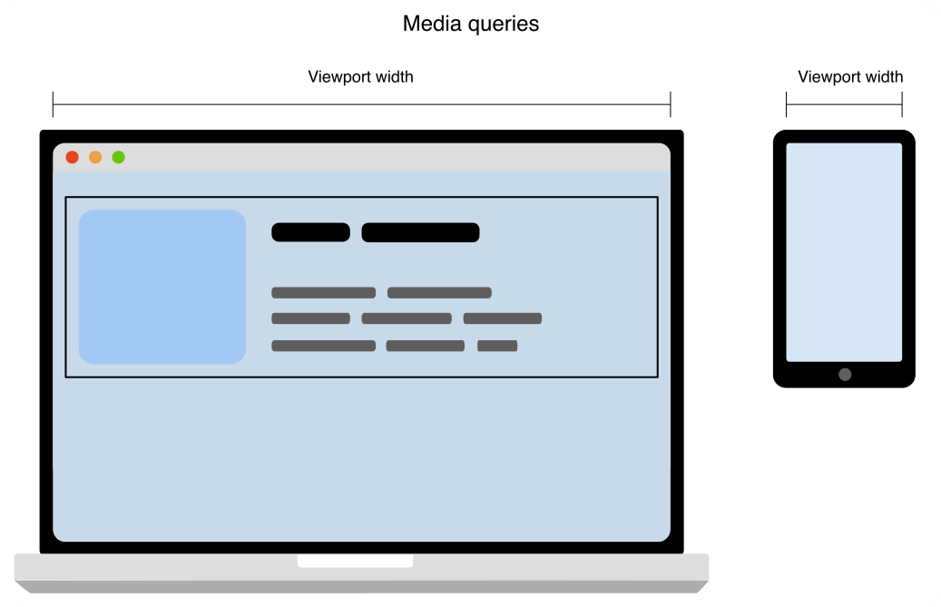
CSS media queries are a key component of responsive design that allow you to apply CSS styles depending on the presence or value of device characteristics.
It's common to apply a media query based on the viewport size so that layout choices can be made for devices with different screen sizes. For example, you may have a smaller font size for devices with small screens, increase the padding between paragraphs when a page is viewed in portrait mode, or increase the size of buttons on touchscreens.

In CSS, use the @media at-rule to conditionally apply part of a style sheet based on the result of a media query.
To conditionally apply an entire style sheet, use @import.
When designing reusable HTML components, you may also use container queries, which allow you to apply styles based on the size of a containing element rather than the viewport or other device characteristics.
Media queries in HTML
In HTML, media queries can be applied to various elements:
- In the
<link>element'smediaattribute, they define the media to which a linked resource (typically CSS) should be applied. - In the
<source>element'smediaattribute, they define the media to which that source should be applied. (This is only valid inside<picture>elements.) - In the
<style>element'smediaattribute, they define the media to which the style should be applied.
Media queries in JavaScript
In JavaScript, you can use the Window.matchMedia() method to test the window against a media query.
You can also use MediaQueryList.addListener() to be notified whenever the state of a query changes.
With this functionality, your site or app can respond to changes in the device configuration, orientation, or state.
You can learn more about programmatically using media queries in Testing media queries.
Reference
At-rules
Guides
- Using media queries
-
Introduces media queries, their syntax, and the operators and media features which are used to construct media query expressions.
- Testing media queries programmatically
-
Describes how to use media queries in your JavaScript code to determine the state of a device, and to set up listeners that notify your code when the results of media queries change (such as when the user rotates the screen or resizes the browser).
- Using media queries for accessibility
-
Learn how Media Queries can help users understand your website better.
Specifications
| Specification |
|---|
| Media Queries Level 4 |
| CSS Conditional Rules Module Level 3 |
See also
- Container queries
- Use
@supportsto apply styles that depend on browser support for various CSS technologies.