A cool-looking box
In this assessment, you'll get some more practice in creating cool-looking boxes by trying to create an eye-catching box.
| Prerequisites: | Before attempting this assessment you should have already worked through all the articles in this module. |
|---|---|
| Objective: | To test comprehension of the CSS box model and other box-related features such as borders and backgrounds. |
Starting point
To get this assessment started, you should:
- Make local copies of the starting HTML and CSS — save them as
index.htmlandstyle.cssin a new directory.
Alternatively, you could use a site like JSBin or Glitch to do your assessment. You could paste the HTML and fill in the CSS into one of these online editors. If the online editor you are using doesn't have a separate CSS panel, feel free to put it in a <style> element in the head of the document.
Note: If you get stuck, then ask us for help — see the Assessment or further help section at the bottom of this page.
Project brief
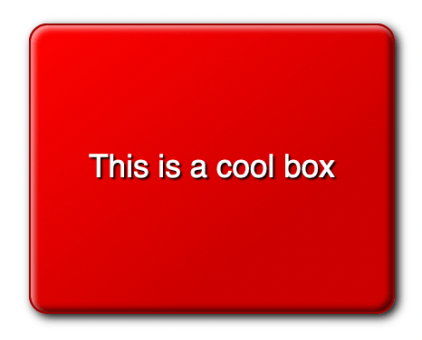
Your task is to create a cool, fancy box and explore the fun we can have with CSS.
General tasks
- Apply the CSS to the HTML.
Styling the box
We'd like you to style the provided <div>, giving it the following:
- A reasonable width for a large box, say around 200 pixels.
- A reasonable height for a large box, centering the text vertically in the process.
- Center the box horizontally.
- Center the text within the box.
- A slight increase in font size, to around 17-18 pixel computed style. Use rems. Write a comment about how you worked out the value.
- A base color for the design. Give the box this color as its background color.
- A contrasting color for the text and a black text shadow.
- A fairly subtle border radius.
- A 1-pixel solid border with a color similar to the base color, but a slightly darker shade.
- A linear semi-transparent black gradient that goes toward the bottom right corner. Make it completely transparent at the start, grading to around 0.2 opacity by 30% along, and remaining at the same color until the end.
- Multiple box shadows. Give it one standard box shadow to make the box look slightly raised off the page. The other two should be inset box shadows — a semi-transparent white shadow near the top left and a semi-transparent black shadow near the bottom right — to add to the nice raised 3D look of the box.
Hints and tips
- Use the W3C CSS Validator to catch and fix mistakes in your CSS.
Example
The following screenshot shows an example of what the finished design could look like:

Assessment or further help
If you would like your work assessed or are stuck and want to ask for help:
- Put your work into an online shareable editor such as CodePen, jsFiddle, or Glitch.
- Write a post asking for assessment and/or help at the MDN Discourse forum Learning category. Your post should include:
- A descriptive title such as "Assessment wanted for A cool-looking box".
- Details of what you have already tried and what you would like us to do; for example, tell us if you're stuck and need help or want an assessment.
- A link to the example you want assessed or need help with, in an online shareable editor (as mentioned in step 1 above). This is a good practice to get into — it's very hard to help someone with a coding problem if you can't see their code.
- A link to the actual task or assessment page, so we can find the question you want help with.