Structuring a page of content
Structuring a page of content ready for laying it out using CSS is a very important skill to master, so in this assessment you'll be tested on your ability to think about how a page might end up looking, and choose appropriate structural semantics to build a layout on top of.
| Prerequisites: | Before attempting this assessment you should have already worked through the rest of the course, with a particular emphasis on Document and website structure. |
|---|---|
| Objective: | To test knowledge of web page structures, and how to represent a prospective layout design in markup. |
Starting point
To get this assessment started, you should go and grab the zip file containing all the starting assets.
The zip file contains:
- The HTML you need to add structural markup to.
- CSS to style your markup.
- Images that are used on the page.
Create the example on your local computer, or alternatively use an online tool such as CodePen, jsFiddle, or Glitch to work on the tasks.
Note: If you get stuck, then ask us for help — see the Assessment or further help section at the bottom of this page.
Project brief
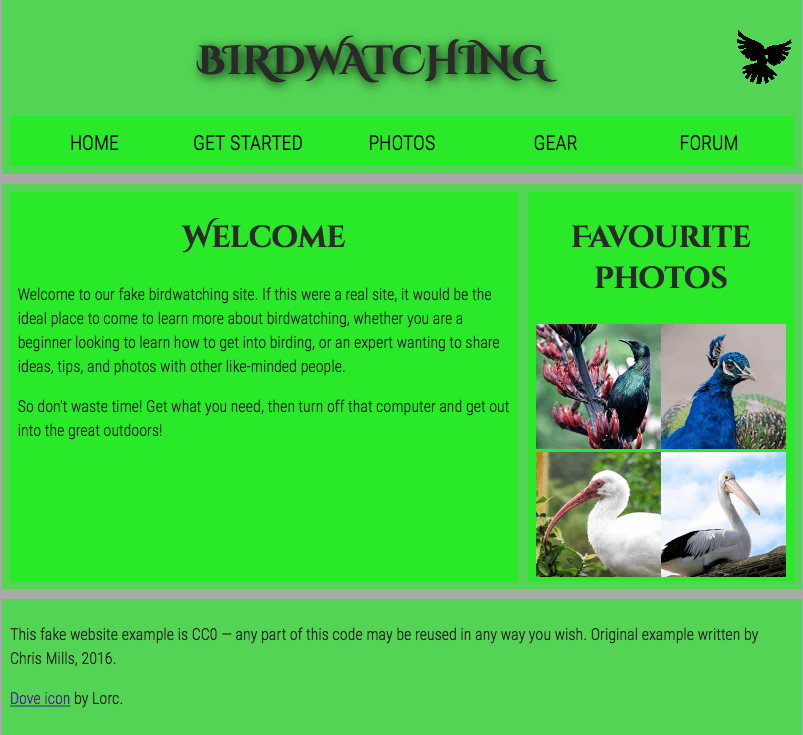
For this project, your task is to take the content for the homepage of a bird watching website and add structural elements to it so it can have a page layout applied to it. It needs to have:
- A header spanning the full width of the site containing the main title for the page, the site logo, and the navigation menu. The title and logo appear side by side once styling is applied, and the navigation appears below those two items.
- A main content area containing two columns — a main block to contain the welcome text, and a sidebar to contain image thumbnails.
- A footer containing copyright information and credits.
You need to add a suitable wrapper for:
- The header
- The navigation menu
- The main content
- The welcome text
- The image sidebar
- The footer
You should also:
- Apply the provided CSS to the page by adding another
<link>element just below the existing one provided at the start.
Hints and tips
- Use the W3C Nu HTML Checker to catch unintended mistakes in your HTML, CSS, and SVG — mistakes you might have otherwise missed — so that you can fix them.
- You don't need to know any CSS to do this assessment; you just need to put the provided CSS inside an HTML element.
- The provided CSS is designed so that when the correct structural elements are added to the markup, they will appear green in the rendered page.
- If you are getting stuck and can't envisage what elements to put where, draw out a simple block diagram of the page layout, and write on the elements you think should wrap each block. This is extremely helpful.
Example
The following screenshot shows an example of what the homepage might look like after being marked up.

Assessment or further help
If you would like your work assessed or are stuck and want to ask for help:
- Put your work into an online shareable editor such as CodePen, jsFiddle, or Glitch.
- Write a post asking for assessment and/or help at the MDN Discourse forum Learning category. Your post should include:
- A descriptive title such as "Assessment wanted for Structuring a page of content".
- Details of what you have already tried and what you would like us to do; for example, tell us if you're stuck and need help or want an assessment.
- A link to the example you want assessed or need help with, in an online shareable editor (as mentioned in step 1 above). This is a good practice to get into — it's very hard to help someone with a coding problem if you can't see their code.
- A link to the actual task or assessment page, so we can find the question you want help with.