Basic native form controls
In the previous article, we marked up a functional web form example, introducing some form controls and common structural elements, and focusing on accessibility best practices. Next, we will look at the functionality of the different form controls, or widgets, in detail — studying all the different options available to collect different types of data. In this particular article, we will look at the original set of form controls, available in all browsers since the early days of the web.
| Prerequisites: | Basic computer literacy, and a basic understanding of HTML. |
|---|---|
| Objective: | To understand in detail the original set of native form widgets available in browsers for collecting data, and how to implement them using HTML. |
You've already met some form elements, including <form>, <fieldset>, <legend>, <textarea>, <label>, <button>, and <input>. This article covers:
- The common input types button, checkbox, file, hidden, image, password, radio, reset, submit, and text.
- Some of the attributes that are common to all form controls.
Note: We cover additional, more powerful form controls in the next two articles. If you want a more advanced reference, you should consult our HTML forms element reference, and in particular our extensive <input> types reference.
Text input fields
Text <input> fields are the most basic form widgets. They are a very convenient way to let the user enter any kind of data, and we've already seen a few simple examples.
Note: HTML form text fields are simple plain text input controls. This means that you cannot use them to perform rich text editing (bold, italic, etc.). All rich text editors you'll encounter are custom widgets created with HTML, CSS, and JavaScript.
All basic text controls share some common behaviors:
- They can be marked as
readonly(the user cannot modify the input value but it is still sent with the rest of the form data) ordisabled(the input value can't be modified and is never sent with the rest of the form data). - They can have a
placeholder; this is the text that appears inside the text input box that should be used to briefly describe the purpose of the box. - They can be constrained in
size(the physical size of the box) andmaxlength(the maximum number of characters that can be entered into the box). - They can benefit from spell checking (using the
spellcheckattribute), if the browser supports it.
Note: The <input> element is unique amongst HTML elements because it can take many forms depending on its type attribute value. It is used for creating most types of form widgets including single line text fields, time and date controls, controls without text input like checkboxes, radio buttons, and color pickers, and buttons.
Single line text fields
A single line text field is created using an <input> element whose type attribute value is set to text, or by omitting the type attribute altogether (text is the default value). The value text for this attribute is also the fallback value if the value you specify for the type attribute is unknown by the browser (for example if you specify type="color" and the browser doesn't support native color pickers).
Note: You can find examples of all the single line text field types on GitHub at single-line-text-fields.html (see it live also).
Here is a basic single line text field example:
html
<input type="text" id="comment" name="comment" value="I'm a text field" />
Single line text fields have only one true constraint: if you type text with line breaks, the browser removes those line breaks before sending the data to the server.
The following screenshot shows default, focused and disabled text input types in Firefox 71 and Safari on macOS and in Chrome 79 and Edge 18 on Windows 10.

Note: We discuss values for the type attribute that enforce specific validation constraints including color, email, and url input types, in the next article, The HTML5 input types.
Password field
One of the original input types was the password text field type:
html
<input type="password" id="pwd" name="pwd" />
The password value doesn't add any special constraints to the entered text, but it does obscure the value entered into the field (e.g. with dots or asterisks) so it can't be easily read by others.
Keep in mind this is just a user interface feature; unless you submit your form securely, it will get sent in plain text, which is bad for security — a malicious party could intercept your data and steal passwords, credit card details, or whatever else you've submitted. The best way to protect users from this is to host any pages involving forms over a secure connection (i.e. located at an https:// address), so the data is encrypted before it is sent.
Browsers recognize the security implications of sending form data over an insecure connection, and have warnings to deter users from using insecure forms. For more information on what Firefox implements, see Insecure passwords.
Hidden content
Another original text control is the hidden input type. This is used to create a form control that is invisible to the user, but is still sent to the server along with the rest of the form data once submitted — for example you might want to submit a timestamp to the server stating when an order was placed. Because it is hidden, the user can not see nor intentionally edit the value, it will never receive focus, and a screen reader will not notice it either.
html
<input type="hidden" id="timestamp" name="timestamp" value="1286705410" />
If you create such an element, it's required to set its name and value attributes. The value can be dynamically set via JavaScript. The hidden input type should not have an associated label.
Other text input types, like search, url, and tel, will be covered in the next tutorial, HTML5 input types.
Checkable items: checkboxes and radio buttons
Checkable items are controls whose state you can change by clicking on them or their associated labels. There are two kinds of checkable items: the checkbox and the radio button. Both use the checked attribute to indicate whether the widget is checked by default or not.
It's worth noting that these widgets do not behave exactly like other form widgets. For most form widgets, once the form is submitted all widgets that have a name attribute are sent, even if no value has been filled out. In the case of checkable items, their values are sent only if they are checked. If they are not checked, nothing is sent, not even their name. If they are checked but have no value, the name is sent with a value of on.
Note: You can find the examples from this section on GitHub as checkable-items.html (see it live also).
For maximum usability/accessibility, you are advised to surround each list of related items in a <fieldset>, with a <legend> providing an overall description of the list. Each individual pair of <label>/<input> elements should be contained in its own list item (or similar). The associated <label> is generally placed immediately before or after the radio button or checkbox, with the instructions for the group of radio button or checkboxes generally being the content of the <legend>. See the examples linked above for structural examples.
Checkbox
A checkbox is created using the <input> element with a type attribute set to the value checkbox.
html
<input type="checkbox" id="questionOne" name="subscribe" value="yes" checked />
Related checkbox items should use the same name attribute. Including the checked attribute makes the checkbox checked automatically when the page loads. Clicking the checkbox or its associated label toggles the checkbox on and off.
html
<fieldset>
  <legend>Choose all the vegetables you like to eat</legend>
  <ul>
    <li>
      <label for="carrots">Carrots</label>
      <input
        type="checkbox"
        id="carrots"
        name="vegetable"
        value="carrots"
        checked />
    </li>
    <li>
      <label for="peas">Peas</label>
      <input type="checkbox" id="peas" name="vegetable" value="peas" />
    </li>
    <li>
      <label for="cabbage">Cabbage</label>
      <input type="checkbox" id="cabbage" name="vegetable" value="cabbage" />
    </li>
  </ul>
</fieldset>
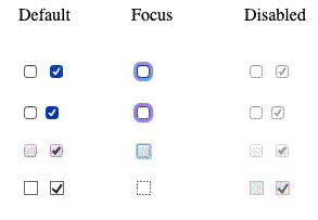
The following screenshots show default, focused and disabled checkboxes in Firefox 71 and Safari 13 on macOS and Chrome 79 and Edge 18 on Windows 10:

Note: Any checkboxes and radio buttons with the checked attribute on load match the :default pseudo-class, even if they are no longer checked. Any that are currently checked match the :checked pseudo-class.
Due to the on-off nature of checkboxes, the checkbox is considered a toggle button, with many developers and designers expanding on the default checkbox styling to create buttons that look like toggle switches. You can see an example in action here (also see the source code).
Radio button
A radio button is created using the <input> element with its type attribute set to the value radio:
html
<input type="radio" id="soup" name="meal" value="soup" checked />
Several radio buttons can be tied together. If they share the same value for their name attribute, they will be considered to be in the same group of buttons. Only one button in a given group may be checked at a time; this means that when one of them is checked all the others automatically get unchecked. When the form is sent, only the value of the checked radio button is sent. If none of them are checked, the whole pool of radio buttons is considered to be in an unknown state and no value is sent with the form. Once one of the radio buttons in a same-named group of buttons is checked, it is not possible for the user to uncheck all the buttons without resetting the form.
html
<fieldset>
  <legend>What is your favorite meal?</legend>
  <ul>
    <li>
      <label for="soup">Soup</label>
      <input type="radio" id="soup" name="meal" value="soup" checked />
    </li>
    <li>
      <label for="curry">Curry</label>
      <input type="radio" id="curry" name="meal" value="curry" />
    </li>
    <li>
      <label for="pizza">Pizza</label>
      <input type="radio" id="pizza" name="meal" value="pizza" />
    </li>
  </ul>
</fieldset>
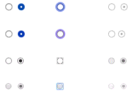
The following screenshots show unchecked and checked radio buttons, radio buttons that have focus, and disabled unchecked and checked radio buttons — on Firefox 71 and Safari 13 on macOS and Chrome 79 and Edge 18 on Windows 10.

Actual buttons
The radio button isn't actually a button, despite its name; let's move on and look at actual buttons! There are three input types that produce buttons:
submit-
Sends the form data to the server. For
<button>elements, omitting thetypeattribute (or an invalid value oftype) results in a submit button. reset-
Resets all form widgets to their default values.
-
Buttons that have no automatic effect but can be customized using JavaScript code.
Then we also have the <button> element itself. This can take a type attribute of value submit, reset, or button to mimic the behavior of the three <input> types mentioned above. The main difference between the two is that actual <button> elements are much easier to style.
html
<input type="submit" value="Submit this form" />
<input type="reset" value="Reset this form" />
<input type="button" value="Do Nothing without JavaScript" />

<button type="submit">Submit this form</button>
<button type="reset">Reset this form</button>
<button type="button">Do Nothing without JavaScript</button>
Note: The image input type also renders as a button. We'll cover that later too.
Note: You can find the examples from this section on GitHub as button-examples.html (see it live also).
Below you can find examples of each button <input> type, along with the equivalent <button> type.
submit
html
<button type="submit">This is a <strong>submit button</strong></button>

<input type="submit" value="This is a submit button" />
reset
html
<button type="reset">This is a <strong>reset button</strong></button>

<input type="reset" value="This is a reset button" />
anonymous
html
<button type="button">This is an <strong>anonymous button</strong></button>

<input type="button" value="This is an anonymous button" />
Buttons always behave the same whether you use a <button> element or an <input> element. As you can see from the examples, however, <button> elements let you use HTML in their content, which is inserted between the opening and closing <button> tags. <input> elements on the other hand are void elements; their displayed content is inserted inside the value attribute, and therefore only accepts plain text as content.
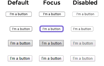
The following examples show default, focused, and disabled button input types — in Firefox 71 and Safari 13 on macOS and Chrome 79 and Edge 18 on Windows 10.

Image button
The image button control is rendered exactly like an <img> element, except that when the user clicks on it, it behaves like a submit button.
An image button is created using an <input> element with its type attribute set to the value image. This element supports exactly the same set of attributes as the <img> element, plus all the attributes supported by other form buttons.
html
<input type="image" alt="Click me!" src="my-img.png" width="80" height="30" />
If the image button is used to submit the form, this control doesn't submit its value — instead, the X and Y coordinates of the click on the image are submitted (the coordinates are relative to the image, meaning that the upper-left corner of the image represents the coordinate (0, 0)). The coordinates are sent as two key/value pairs:
- The X value key is the value of the
nameattribute followed by the string ".x". - The Y value key is the value of the
nameattribute followed by the string ".y".
So for example when you click on the image at coordinate (123, 456) and it submits via the get method, you'll see the values appended to the URL as follows:
http://foo.com?pos.x=123&pos.y=456
This is a very convenient way to build a "hot map". How these values are sent and retrieved is detailed in the Sending form data article.
File picker
There is one last <input> type that came to us in early HTML: the file input type. Forms are able to send files to a server (this specific action is also detailed in the Sending form data article). The file picker widget can be used to choose one or more files to send.
To create a file picker widget, you use the <input> element with its type attribute set to file. The types of files that are accepted can be constrained using the accept attribute. In addition, if you want to let the user pick more than one file, you can do so by adding the multiple attribute.
Example
In this example, a file picker is created that requests graphic image files. The user is allowed to select multiple files in this case.
html
<input type="file" name="file" id="file" accept="image/*" multiple />
On some mobile devices, the file picker can access photos, videos, and audio captured directly by the device's camera and microphone by adding capture information to the accept attribute like so:
html
<input type="file" accept="image/*;capture=camera" />
<input type="file" accept="video/*;capture=camcorder" />
<input type="file" accept="audio/*;capture=microphone" />
Common attributes
Many of the elements used to define form controls have some of their own specific attributes. However, there is a set of attributes common to all form elements. You've met some of these already, but below is a list of those common attributes, for your reference:
| Attribute name | Default value | Description |
|---|---|---|
autofocus |
false | This Boolean attribute lets you specify that the element should automatically have input focus when the page loads. Only one form-associated element in a document can have this attribute specified. |
disabled |
false |
This Boolean attribute indicates that the user cannot interact with the
element. If this attribute is not specified, the element inherits its
setting from the containing element, for example,
<fieldset>; if there is no containing element
with the disabled attribute set, then the element is
enabled.
|
form |
The <form> element that the widget is associated with,
used if it is not nested within that form. The value of the attribute
must be the id attribute of a
<form> element in the same document. This lets
you associate a form control with a form it is outside of, even if it is
inside a different form element.
|
|
name |
The name of the element; this is submitted with the form data. | |
value |
The element's initial value. |
Test your skills!
You've reached the end of this article, but can you remember the most important information? You can find some further tests to verify that you've retained this information before you move on — see Test your skills: Basic controls.