Grid Areas
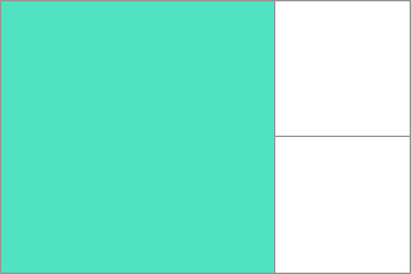
A grid area is one or more grid cells that make up a rectangular area on the grid. Grid areas are created when you place an item using line-based placement or when defining areas using named grid areas.

Grid areas must be rectangular in nature; it is not possible to create, for example, a T- or L-shaped grid area.
Example
In the example below I have a grid container with two grid items. I have named these with the grid-area property and then laid them out on the grid using grid-template-areas. This creates two grid areas, one covering four grid cells, the other two.
css
.wrapper {
  display: grid;
  grid-template-columns: repeat(3, 1fr);
  grid-template-rows: 100px 100px;
  grid-template-areas:
    "a a b"
    "a a b";
}
.item1 {
  grid-area: a;
}
.item2 {
  grid-area: b;
}
html
<div class="wrapper">
  <div class="item1">Item</div>
  <div class="item2">Item</div>
</div>
See also
Property reference
Further reading
- CSS Grid Layout Guide: Basic concepts of grid layout
- CSS Grid Layout Guide: Grid template areas
- Definition of Grid Areas in the CSS Grid Layout specification